Fast Track to purchase

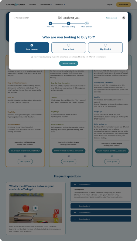
An entryway for Everyday Speech's products
My Role
Product Strategy
UX Design
Product Management
Timeline
One quarter
Methods
Wireframing
User Flows
Med-Fi Prototyping

My Impact

  • Improved delivery of information so the user had fewer decisions to make in order to understand which product was right for them
  • Streamlined high-intent users' flow to accomplish the tasks they want like starting a free trial, generating a quote, or booking a call
  • Empowered the company to better understand who the user is and what stage of the buying process they are in to maximise conversions from website visitor to free trial user
  • Ensured timely Design Hand-off through management of our UI freelancer

Project overview

Project Shaping
After understanding the CEO's and Director of CX's understanding of the problems on our website, I established that my suggested solution needed to respect the following criteria.
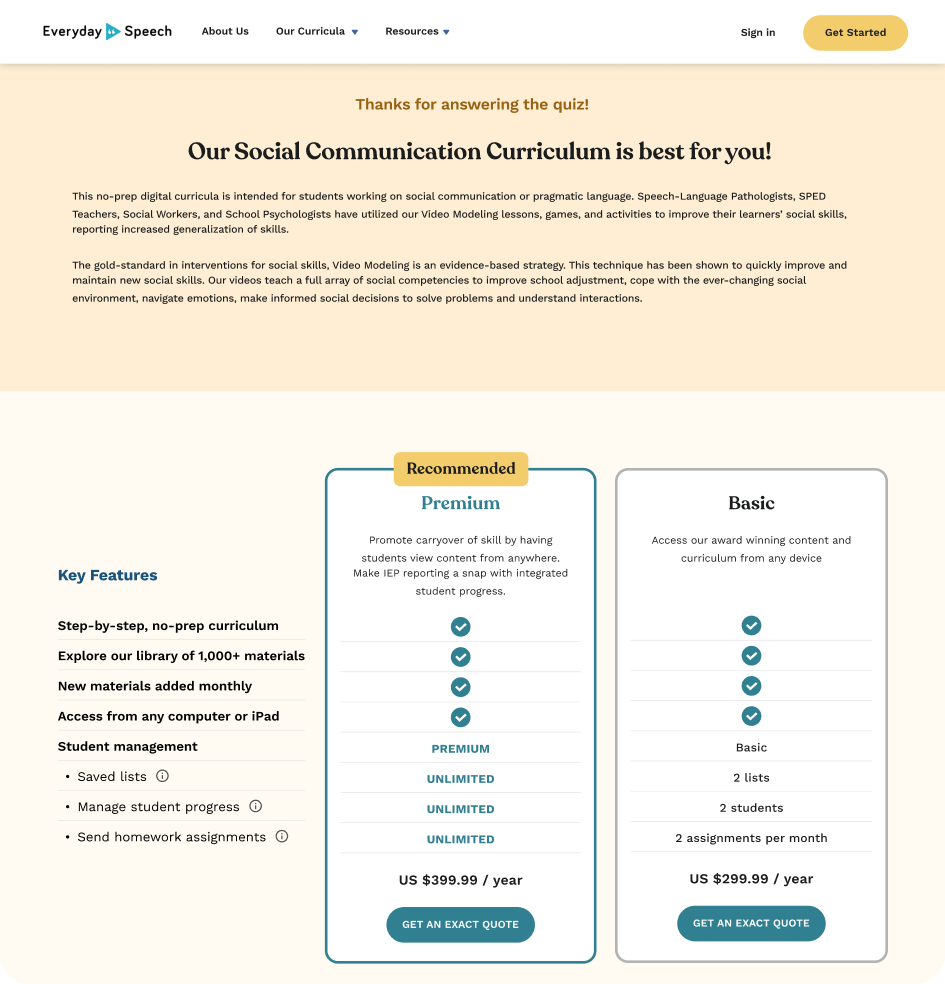
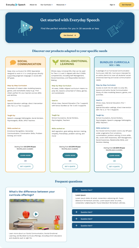
  • The potential customer must be able to know immediately that 3 different products are available and get a rough idea of their pricing. If they are already self-informed, it will be easy for them to choose the one they want and initiate a free trial.
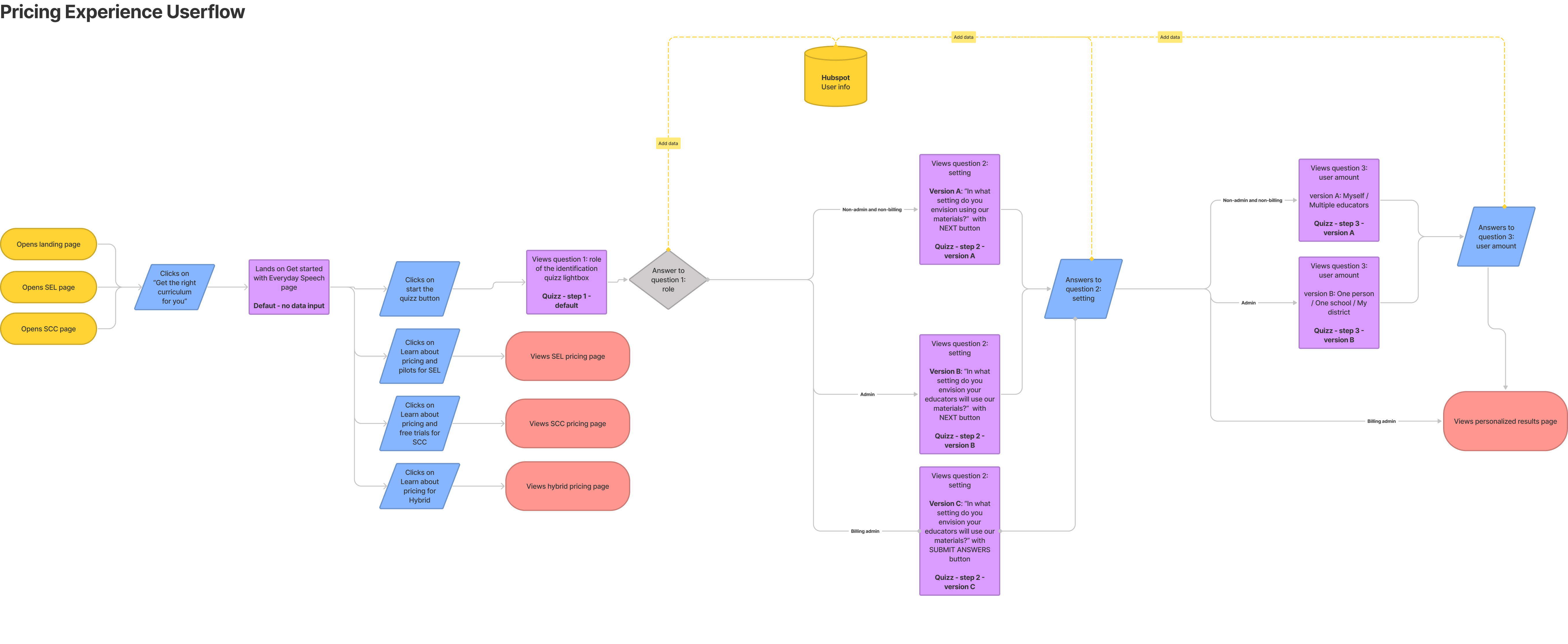
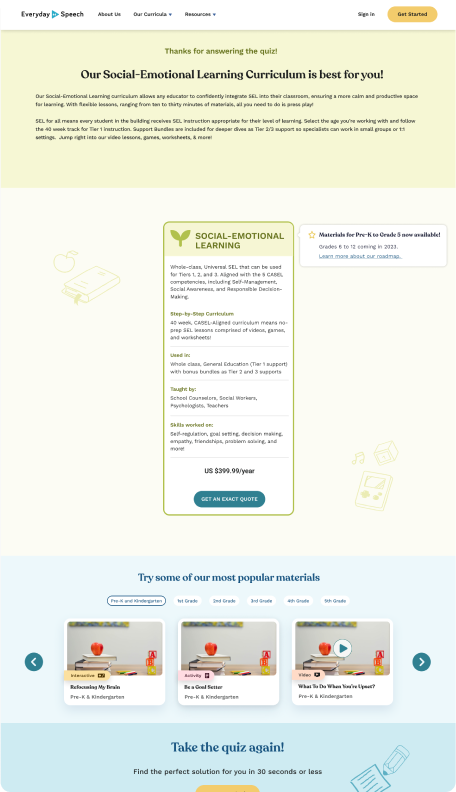
  • If the user is not well informed, we guide them to the best product, depending on their use scenario. For example, a speech-language pathologist teaching social emotional learning in a 1:1 setting will be directed to the Social Communications curriculum.
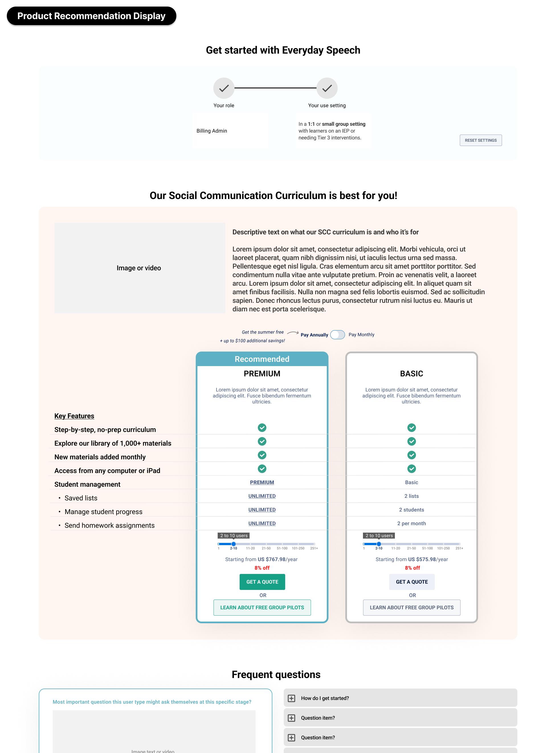
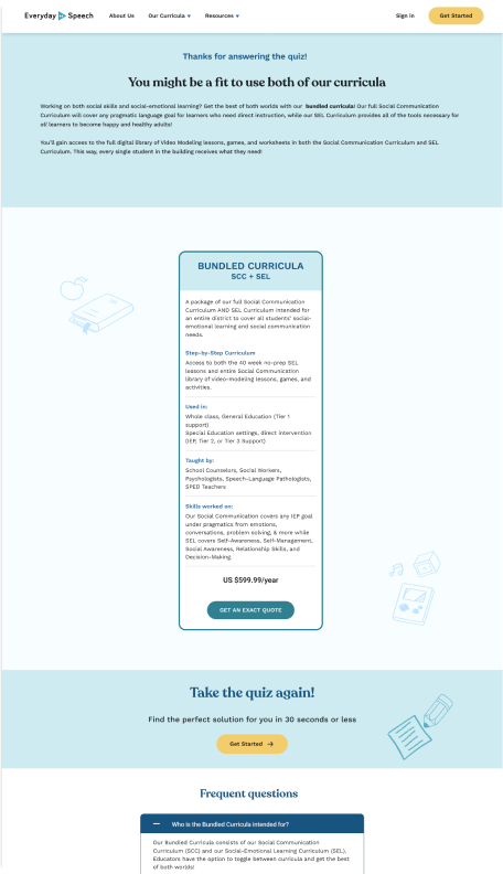
  • The information displayed on the results page must be personalized depending on who is browsing it: administrative personnel must see more information about purchasing logistics rather than sample materials.
Ideation

Several Design Options

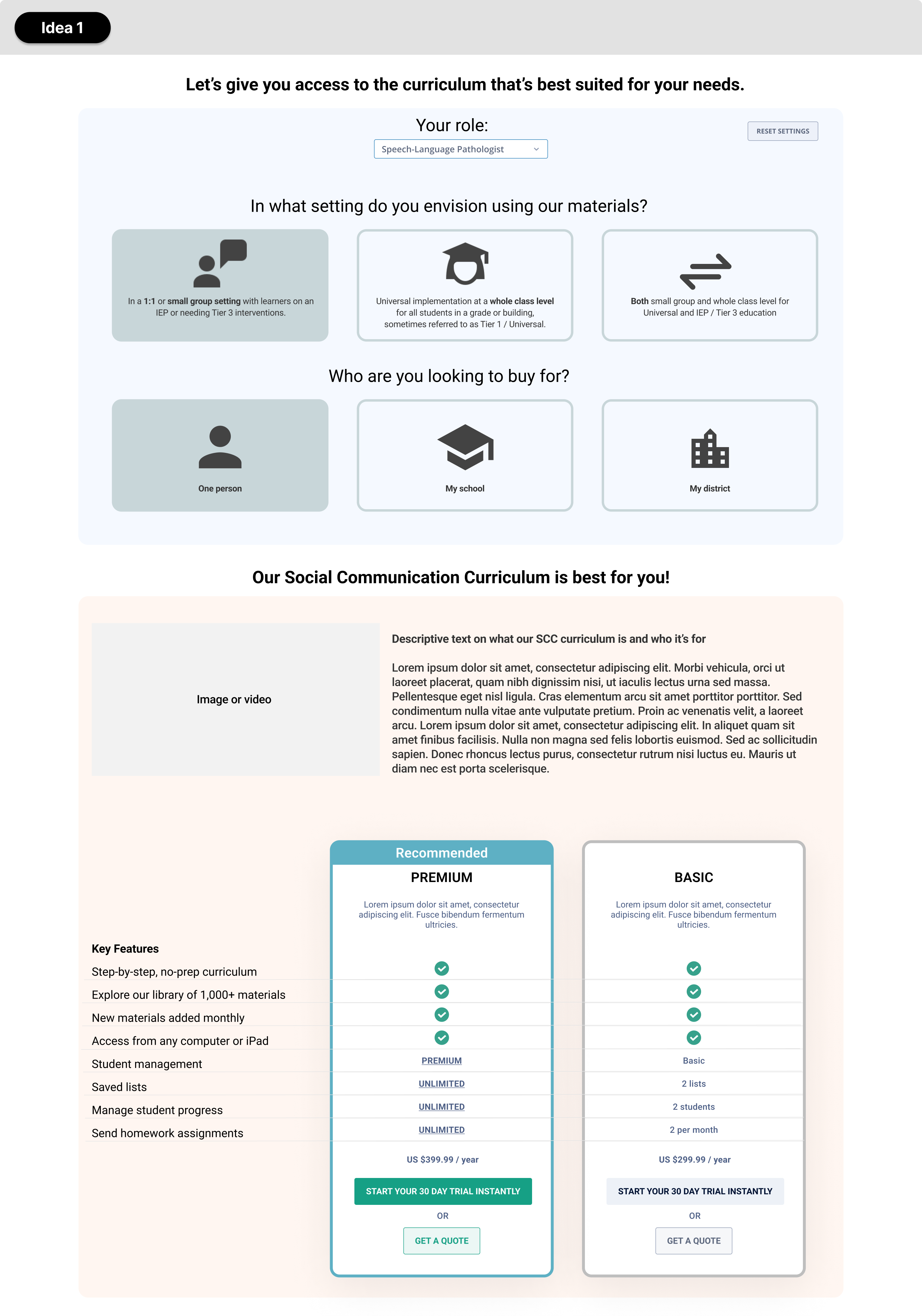
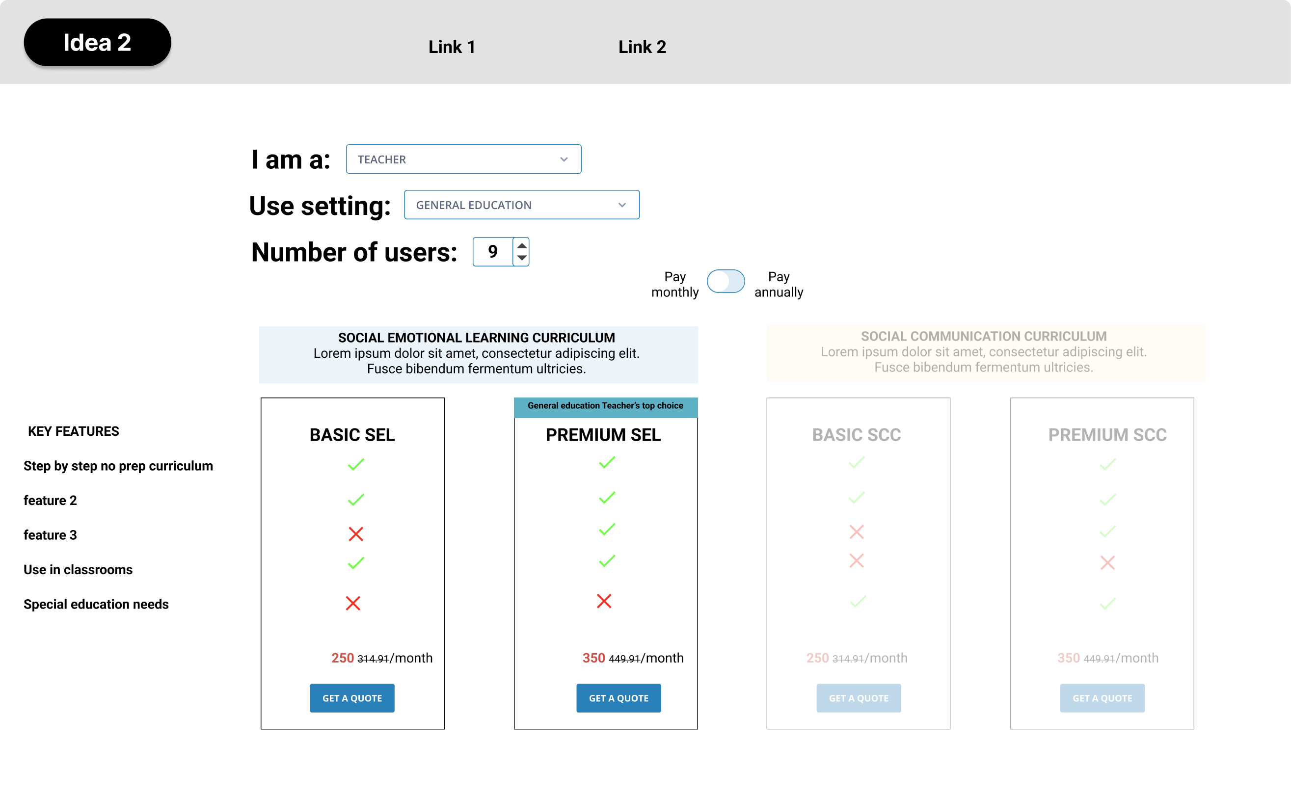
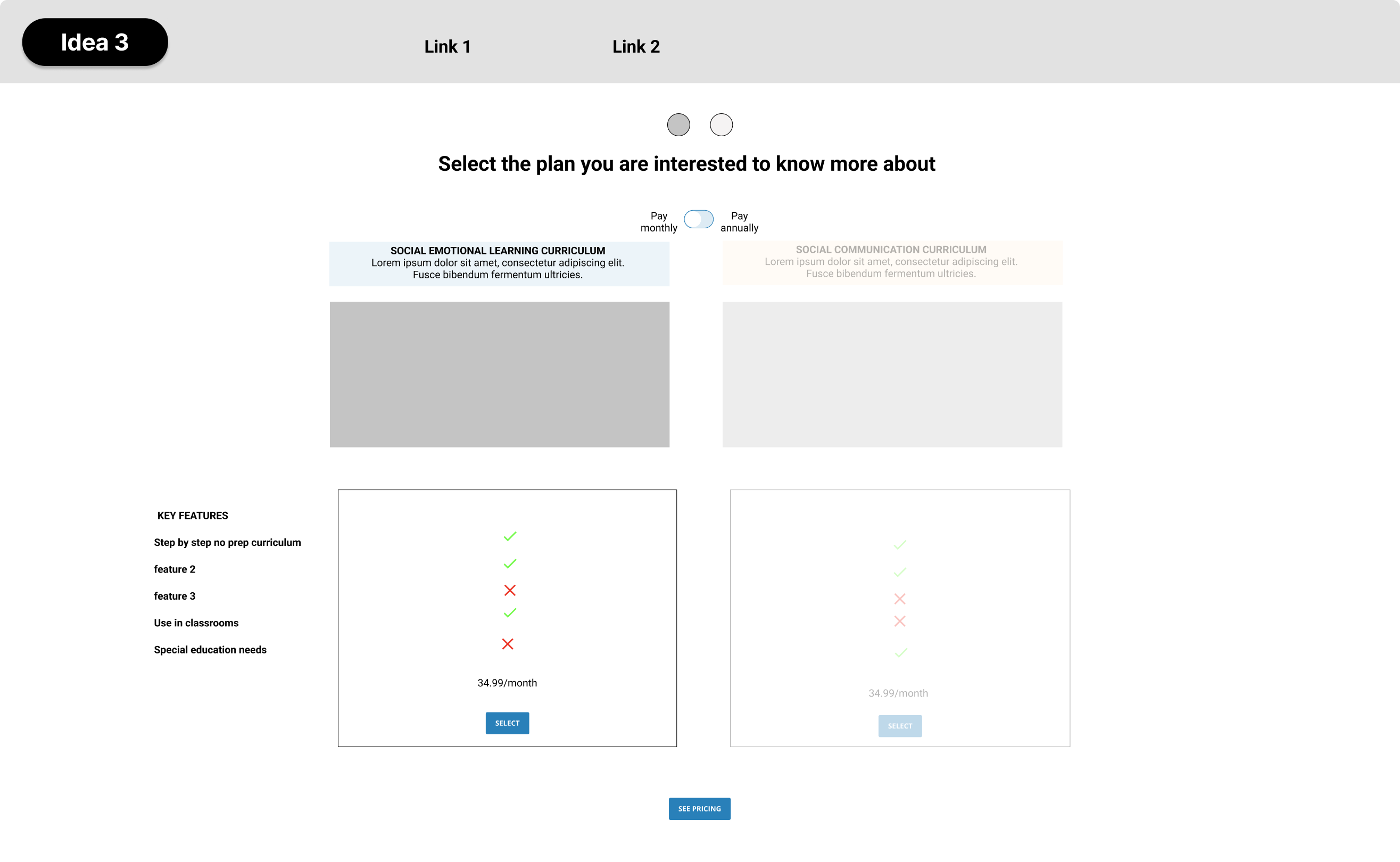
After investigating how several websites presented their offers and consulting the psychology of price and offer display, I started low-fi ideation and came up with 3 versions of the experience:
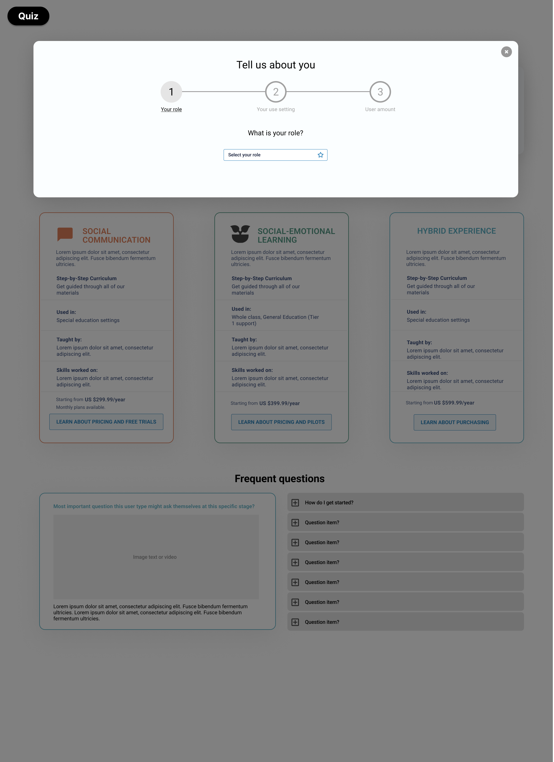
  • Idea 1: a questionnaire that will guide the customer to the right curriculum and present all its details while still allowing to see a preview of all plans
  • Idea 2: ability to view all offers in one page + dynamically update the highlighted offer depending on the user’s parameters
  • Idea 3: ability to select one offer to the get to the conversion action
Idea 3 was selected by the main stakeholders as it presented the core information for 3 products in a more synthetic way which still allowed more detailed and personalized information about 1 product once the user answered the quiz.
Med-Fi Design

Iterate, iterate, iterate

I then proceeded with 2 design med-fi iterations of the concept and user flow. Feedback from stakeholders on the first version revealed the following main issues/needs, that were fixed in the next iteration:
  • Quicker access to information if user does not want us to tell them about themselves
  • Remove some complexity of the flow by fusing some experiences (e.g. show specialists that choose “multiple users” a lot of the same pricing options that we show admins)
  • Improve premium offer highlighting & sample content visualization
  • Show more product samples
Project Management

Managing a UI freelancer

Once I was done with the UX work, a freelance UI designer took over the work for the high-fidelity designs, as I had been assigned to higher priority design work on other projects. I was there along the way to guide his tasks, provide him with our design guidelines and feedback, and ensure everything was going according to the plan.
Final Words

You can experience the quiz in it's live version over here!

Unfortunately for this project, I was not able to do primary user research due to budget constraints. This meant I thoroughly asked for all the context from our internal stakeholders with strong integrated knowledge about our users and business to inform the decisions, which was still a great learning experience!

Go back to portfolio